

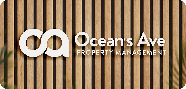
Ocean’s Ave Property Management
Ocean’s Avenue Property Management is a Connecticut-based property management company serving the Southeast shoreline, including New London and surrounding areas. Built from hands-on experience as both an investor and operator, the company focuses on managing single-family and small multifamily properties with a practical, grounded approach.
Their services are designed for property owners who value consistency and long-term performance—handling leasing, maintenance, and day-to-day operations with a focus on protecting assets and maintaining quality tenants. With a deep understanding of older housing stock and local market conditions, Ocean’s Avenue provides a steady, knowledgeable presence for both seasoned investors and accidental landlords.
As the company grew, its brand no longer reflected the clarity and professionalism of the experience it delivered—creating a disconnect between perception and reality.


Brand strategy & identity.
Grounding a high-performance service in clarity and trust.
The brand needed to reflect True 10’s balance of experience, discipline, and approachability. Positioned as a dependable, results-driven partner, the identity emphasizes consistency, transparency, and long-term value—more aligned with a trusted operator than a transactional service provider.
A clean, structured visual system paired with confident, straightforward typography reinforces clarity and control. The result is a brand that feels steady, capable, and easy to trust—mirroring the experience clients receive behind the scenes.
let’s chat about your brand
Visual identity.
Inspired by coastal influence, practical structure, and quiet confidence.
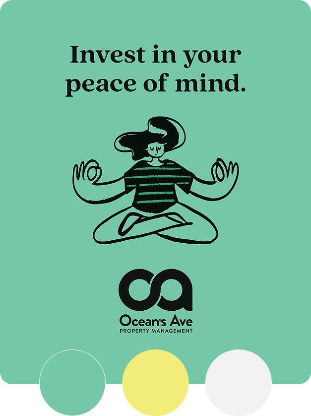
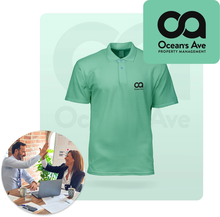
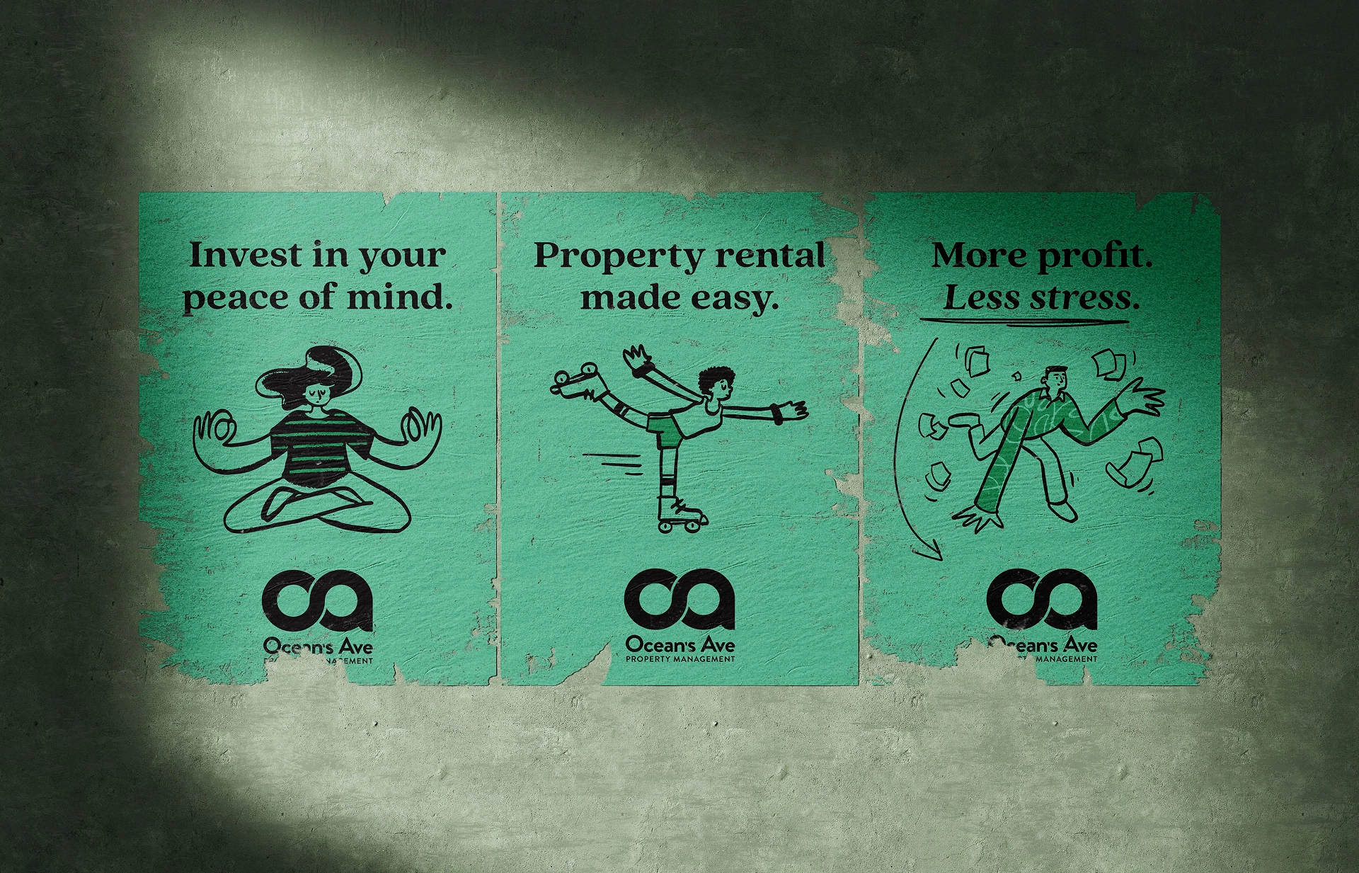
The visual identity draws from the surrounding shoreline environment while maintaining a clean, modern structure. Subtle nautical cues—balanced with minimal forms and strong typography—anchor the brand in place without becoming overly thematic. The system reflects both the coastal setting and the disciplined approach to management.
Supporting elements introduce warmth and approachability. A restrained color palette avoids harsh or overly bright tones, instead focusing on grounded, natural hues that feel professional and inviting. Typography prioritizes readability and simplicity, reinforcing clarity at every touchpoint. Together, the identity feels modern, capable, and quietly distinctive—bridging local character with structured execution.
get a free brand consult
The outcome.
A refined brand that communicates clarity, control, and reliability.
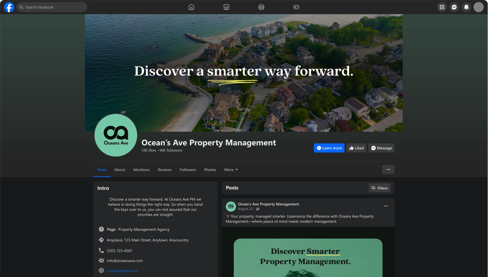
The updated brand now reflects the experience Ocean’s Avenue delivers—steady, knowledgeable, and built on trust. From the structured visual identity to the approachable tone of messaging, every element works together to create a cohesive and professional presence.
This alignment strengthens how the company is perceived, positioning it as a capable partner for investors and property owners alike. Clients can quickly understand the value, feel confident in the process, and trust that their properties are being managed with care and responsibility. The result is a brand that supports growth while reinforcing consistency, credibility, and long-term stewardship.
Schedule your free brand consult