

Brand strategy & identity.
Grounding a high-performance service in clarity and trust.
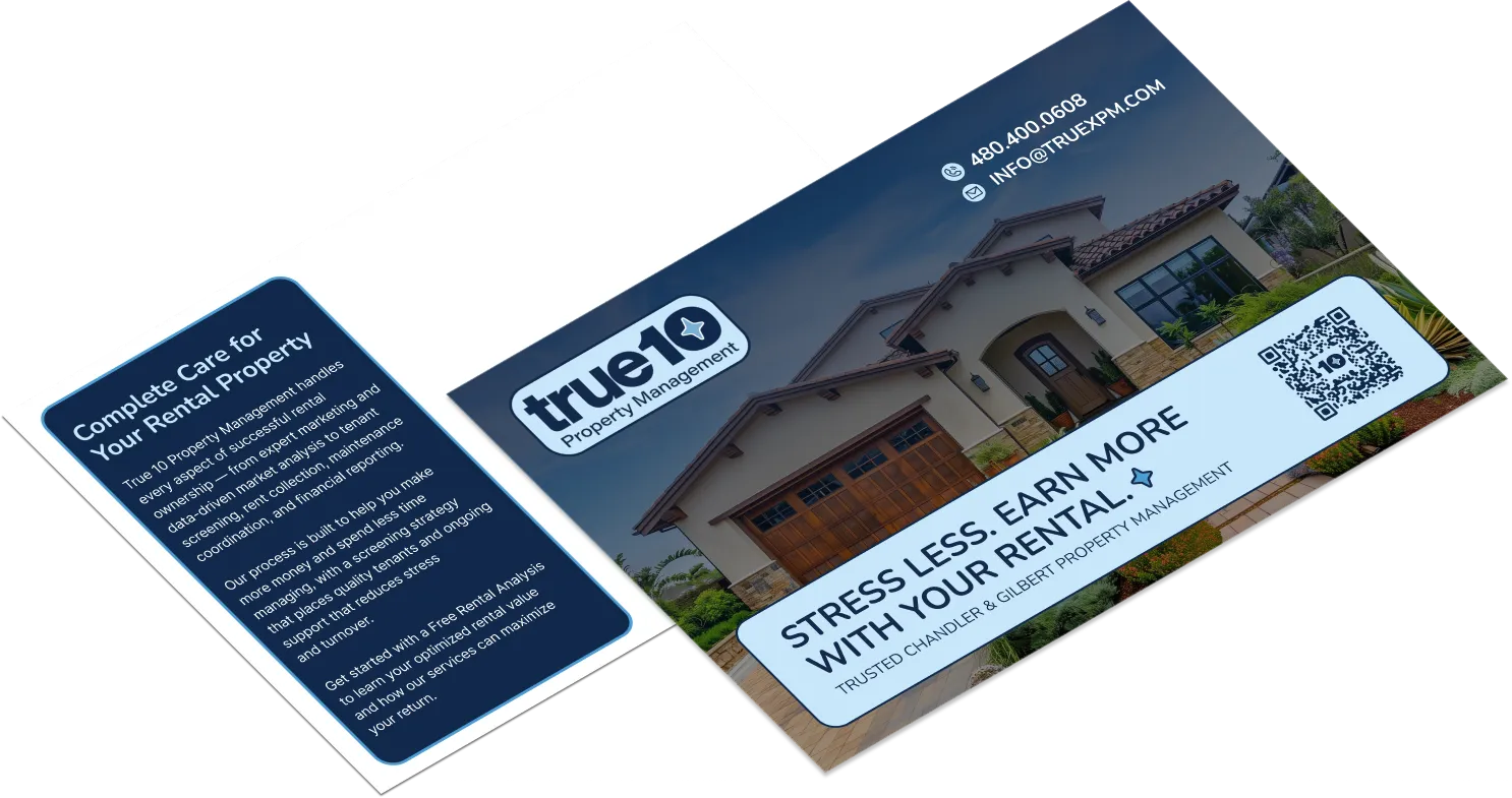
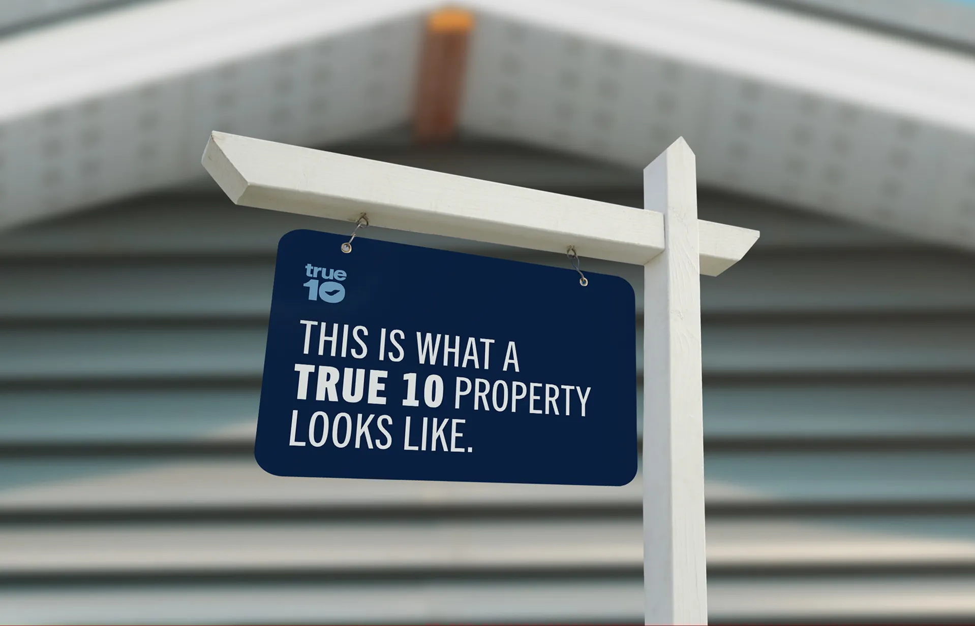
The brand needed to reflect True 10’s balance of experience, discipline, and approachability. Positioned as a dependable, results-driven partner, the identity emphasizes consistency, transparency, and long-term value—more aligned with a trusted operator than a transactional service provider.
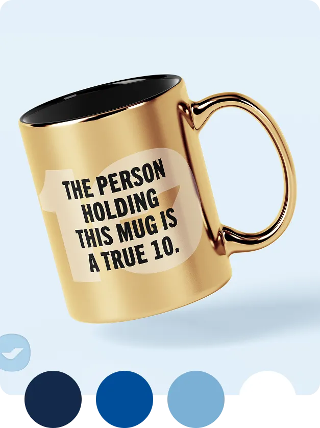
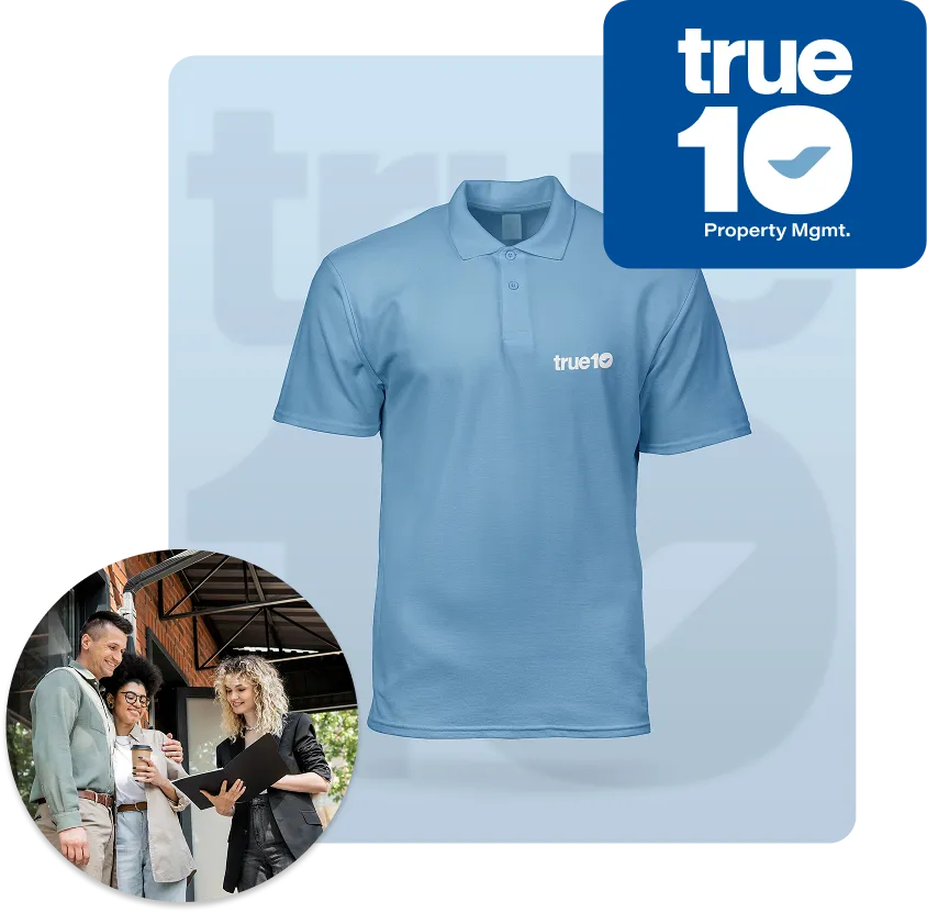
A clean, structured visual system paired with confident, straightforward typography reinforces clarity and control. The result is a brand that feels steady, capable, and easy to trust—mirroring the experience clients receive behind the scenes.
let’s chat about your brand
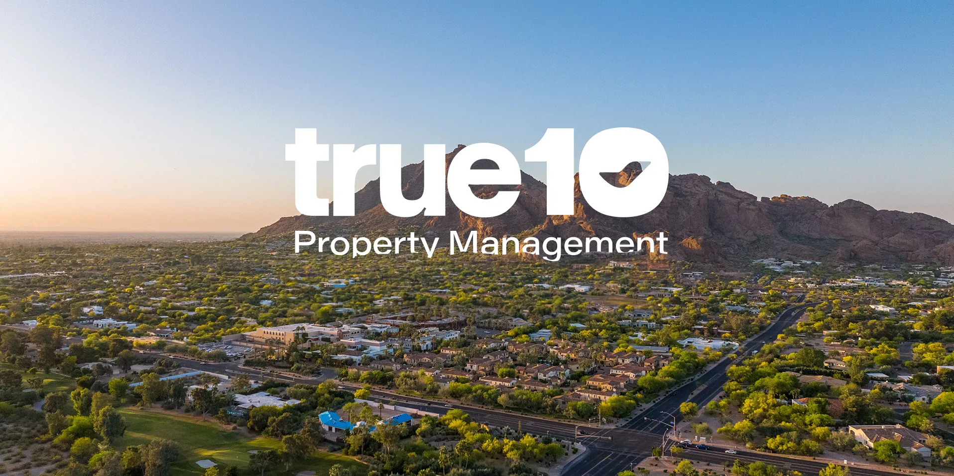
Visual identity.
Inspired by disciplined execution and operational clarity.
The identity draws from the idea of structure and performance—where every element serves a clear purpose. Clean lines, balanced layouts, and intentional spacing reflect the company’s process-driven approach to property management, reinforcing reliability and control at every touchpoint.
Supporting elements focus on clarity and usability. Typography is straightforward and highly legible, while visual hierarchy ensures information is easy to navigate—mirroring the transparent reporting and communication systems clients rely on.
get a free brand consult