
Branding is everything in property management. The right colors can communicate trust, luxury, affordability, or all three. But there’s a serious risk many companies overlook: ignoring ADA compliance color specifications. When your website isn’t accessible, your colors might be doing more harm than good.
Key Takeaways
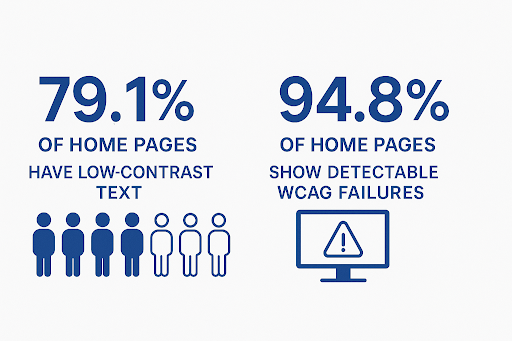
Nearly 8 out of 10 websites fail basic color contrast checks, with 79.1% of homepages showing low-contrast text issues in 2025.
Ignoring ADA compliance color risks losing almost 29% of U.S. adults, as many live with disabilities that affect how they see online content.
Website accessibility lawsuits are rising, with over 8,800 ADA Title III complaints filed in 2024, making compliance a financial priority.
Why Color Accessibility Matters
The Americans with Disabilities Act (ADA) is also catching up with digital access. By law and public expectation, websites must meet certain accessibility standards, especially around color contrast. Web Content Accessibility Guidelines (WCAG) level 2.1 AA is the baseline. Among its rules:
Text and background contrast should be at least 4.5 to 1 for normal text, 3 to 1 for large text.
Color alone should never convey critical information, such as error messages and links, because many people can’t distinguish certain color differences.
According to the WebAIM Million report, 79.1% of home pages still have low-contrast text issues. It means nearly 8 out of 10 sites are failing on one of the most basic color standards. Also, 94.8% of homepages tested in 2025 show detectable WCAG failures. So, ignoring ADA compliance color isn’t rare. It’s the norm.
The Real Costs of Ignoring ADA Compliance Color
Choosing brand-perfect colors without checking ADA compliance might look harmless. But the risks are real:
Legal Exposure: Complaints or litigation are rising. In 2024, there were about 8,800 ADA Title III complaints related to inaccessible websites.
Lost Audience and Leads: Roughly 28.7% of U.S. adults have a disability that could affect how they view websites, like blurry vision, color blindness, etc. If your brand colors are hard to read, you’ll lose prospects before they even register interest.
Reputation and Trust: Brand identity matters. If your site looks gorgeous but feels unusable to many, it undermines credibility. Remember that accessibility is always part of the user experience.
How Property Managers Can Avoid Color-Related Pitfalls
Here are actionable steps for property management firms to make sure they’re not falling into the “ignoring ADA compliance color” trap:
1. Audit your color palette
Use tools like WebAIM’s contrast checker or other WCAG-based contrast-testing tools to check your website’s ADA compliance. Test text vs. backgrounds, buttons vs. surrounding area, even borders or overlays.
2. Adjust existing brand colors
Often, you don’t need to throw away your brand identity. Just tweak hues (lighter/darker) or saturation so text stands out.
3. Use dual cues
For links or error messages, use more than color. Underlines, shapes, and icons help.
4. Consider mobile appearance
On smaller screens or in bright daylight, low contrast gets worse. Always test on devices.
Pro Tip: Make accessibility part of the design process, not an afterthought. If you redesign the logo, website, or signage, check contrast early.
What the Standards Say vs What Often Happens
WCAG 2.1 Level AA is required under recent ADA rules for state and local government web content and mobile apps. But automation reports like WebAIM show nearly every site still fails somewhere, especially on contrast.
This mismatch between what standards demand and what brand design often delivers is where ignoring ADA compliance color becomes complicated.
Protect Your Business by Checking Color Compliance
Your brand’s colors are powerful. They set the tone, build recognition, and evoke emotion. But they can also exclude. Ignoring ADA compliance color is a financial, legal, and moral risk. If you’re in property management in the U.S., this is critical. Your website is likely one of your first impressions, so make sure that you invite people in and don't shut them out.
Need help assessing your color palette or designing a compliant website? Schedule a consultation with us now, and we’ll make sure your branding is not just appealing but inclusive, too.
FAQs
Can using color-blindness simulators help me avoid ADA color issues?
Yes. Simulators show you how your site looks to people with color vision deficiencies. They make it easier to spot when your colors fail. Still, pair them with contrast checkers and real-user testing for a full picture.
Is fixing low-contrast text expensive if I catch it late?
Usually, yes. Fixing it after launch means redesigning parts of your site, tweaking CSS, swapping graphics, and sometimes paying legal fees. It’s cheaper to get it right from the start.
Can poor color contrast get me into legal trouble?
Low contrast is one of the top issues cited in ADA lawsuits. Even unintentional violations can lead to fines. In fact, the first violation can reach $75,000, and repeat issues cost more.